9 Steps to Achieving an Amazing Mobile User Experience & Avoiding SEO Demotion
In 2015 the Google mobilegeddon was a hot topic for SEOs who were positive that Google’s changing mobile ranking algorithm would see major demotions for unprepared websites. Despite the initial update going out in April 2015, the fun is still not over; we saw a new Google mobile friendly update in 2016, and we’re constantly learning more about Google’s plans for mobile search. Most importantly, Google is planning to make the mobile index its primary index, and has already been testing mobile-first search, which means websites need to be fully optimised in order to avoid SEO demotion when the mobile-first index is properly rolled out. You need to provide awesome mobile UX if you’re to compete in light of Google’s latest updates.
So what is mobile UX and how can you make it awesome? When it comes to mobile, users want to browse quickly, complete tasks with as few steps as possible, and consume content easily on small screens. To ensure you’re providing an amazing experience on mobile, we’ve outlined the best practices and essentials of mobile optimisation below.
Step 1: Check your website with Google’s Mobile-Friendly Test
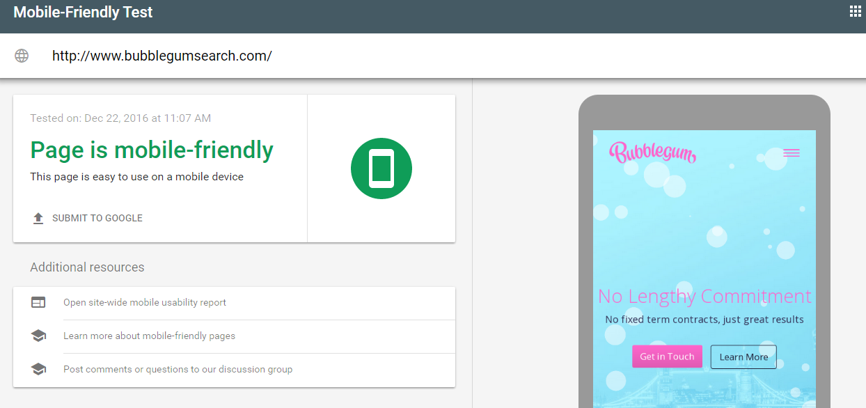
Rather than simply guessing as to whether your site is mobile-friendly, start by taking Google’s Mobile-Friendly Test which analyses any inputted URL and tells you whether or not its mobile-friendly, whilst providing a preview of how the page looks on a mobile screen. If the page isn’t mobile friendly, it will tell you exactly which issues need work, for example the text being too small or clickable elements being too close together. You then have a list of actionable issues to work on to improve your mobile UX.
Step 2: Explore mobile UX design tools
Redesigning your site for a better mobile UX can be a complex job, so if you don’t have a web design team on hand or a budget big enough to use one, you’ll need some tools to help you out. If you’re using a CMS like WordPress or Shopify, you’ll likely be able to use a pre-built, responsive template or theme which will significantly help you along your mobile-friendly mission. If you have a custom site design and don’t want to be restricted by a theme or template, consider using a drag and drop platform such as WebFlow or Weebly, both of which prioritise responsive design to ensure sites are mobile-friendly from the get go.
Step 3: Nail the basic user experience best practices
Text should scale to allow comfortable reading on small screens, and it should be in a clear, legible font. Clickable elements need to be large enough to tap easily, and not too close together to risk the wrong link being tapped. Page layouts should respond to screen sizes so that users don’t have to scroll horizontally to consume your content or pinch the screen to zoom in or out. Images should be optimised for smaller screens, and multiple images sizes should be made available so that mobiles don’t have to download incredibly large images (thus lagging page speed) and can instead use an appropriately sized image.
Step 4: Consider how visitors will be using your site
Will visitors be seeking information, trying to contact you, or making a purchase? By considering the intention of the user, you can provide functionality that fulfils their needs by placing buttons or calls to action front and centre of your pages. Hiding these functionalities below the fold, in complex navigation bars or in your site’s footer will slow down the user’s ability to fulfil their intention and increase the risk of them abandoning your page.
Step 5: Assess your site functionality and architecture
Mobile browsing is so heavily favoured because it tends to be quicker and simpler than using desktops. With this in mind, you need to ensure your site is functional and easy to navigate. You should think carefully about your site’s architecture; make categories simple, intuitive and easy to tap with descriptive labels, consider implementing tappable breadcrumbs, and make it easy to reach your homepage from any other page on your site.
Step 6: Streamline your conversion process
No matter if its checking out, completing a contact form or requesting a quote, all types of conversions need to be simple and easy to do on mobile. Keep fields in your forms to a minimum, make the most of autofill functionality, consider toggle or dropdown menus where possible and label fields thoroughly to minimise errors. If you’re trying to get visitors to call you, make it easy for them by providing click-to-call buttons so that they don’t have to copy and paste your phone number - these extra steps take the convenience out of mobile browsing.
Step 7: Remove intrusive interstitials
Google has announced that from January 2017 they’ll be punishing pages which use interstitials that are intrusive for mobile users. This includes:
- Popups that cover the main content and occur as soon as a page loads or whilst a user is browsing a page
- Standalone interstitials that must be dismissed before viewing main content
- Layouts which have above-the-fold content that looks like a standalone interstitial and place main content beneath the fold.
Cookies, age verification and login interstitials will be permitted, as are banners provided that they don’t block the majority of the main content.
Step 8: Make your pages fast
According to a Google study, 53% of visits to sites via mobile are abandoned if it takes longer than 3 seconds for a page to load, so it is tantamount that you make your site as speedy as possible. There’s a huge variety of things you can do to speed up your pages, including removing render-blocking JavaScript, enabling Gzip compression, optimising image files and minifying your CSS. Use Google’s Test My Site tool to discover exactly how fast your site loads on mobile and to get recommendations on ways to speed things up.
Step 9: Apply mobile UX best practices to your entire site
Google assesses mobile-friendliness on a page by page basis, but that doesn’t mean you should only optimise mobile UX on your key landing pages. If anything is more annoying than browsing a desktop site on mobile, its browsing a site with a mixture of desktop and mobile-optimised pages. Be consistent, and ensure that every single page on your site offers an awesome mobile experience.
Author Bio:
Matt Cayless is the Director of Client Strategy at Bubblegum Search an SEO & Content Marketing Agency. He has a passion for helping SMEs fight off Google Pandas and Penguins. When he’s not casing the Google algorithms, you can find him training for his next marathon and listening to 80’s pop ballads. Follow him on Twitter @matt_cayless.